Redesign Travel Booking Experience
Transforming an outdated, ambiguous funnel into a high-conversion digital ecosystem.

This project was built for a major travel and tourism client in France. Due to non-disclosure agreements, I have white-labeled the branding and modified proprietary details, but the core UX architecture and system-first solutions remain fully accurate.

Role
UI and UX Design
Client
Confidential
(French / Travel & Tourism Sector)

Platform
Responsive Web & Mobile

Timeline
2 weeks
2024

Scope

  • End-to-End UX Research
  • Information Architecture
  • UI Design
  • Scalable Design System
  • Interactive Prototyping
THE CHALLENGE
The client approached with a highly ambiguous brief: their existing booking funnel felt outdated, resulting in user confusion and dropped conversions. With no legacy analytics available, my first task was to audit the complex flow and translate a vague requirement – “everything needs to change” – into measurable, user-centric design goals within a rapid 3-week timeline.
THE STRATEGY
I focused on reducing cognitive friction by re-architecting the information hierarchy. By replacing inconsistent inputs with predictable UI patterns and introducing clear progressive steps, the new solution seamlessly aligns the booking experience with the client’s evolved brand identity while eliminating ambiguity for both travelers and guides.

Booking Challenge

Unclear, complex booking flow

Confuse travellers and guides

The client came with a broad brief: the existing booking form felt outdated across the board, and they wanted a modern booking experience that matched their new branding. There was no detailed list of issues, so the first task was to turn “everything needs to change” into clear, workable design goals.

Booking Goals

Easy, clear, intuitive booking flow

Confuse travellers and guides

Make the purpose and the steps of the flow clear from the first screen. Reduce effort by using the right input for each question.
Remove ambiguity with clearer labels, helper text and better-structured questions.
Create a clear visual hierarchy that is easy to scan and accessible.
Align the interface with the client’s new brand identity.

Pain Points

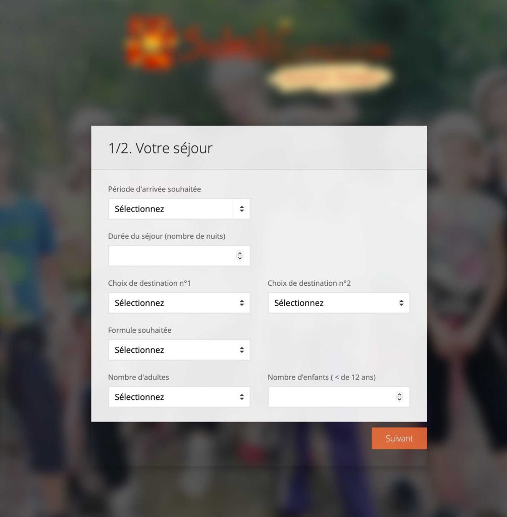
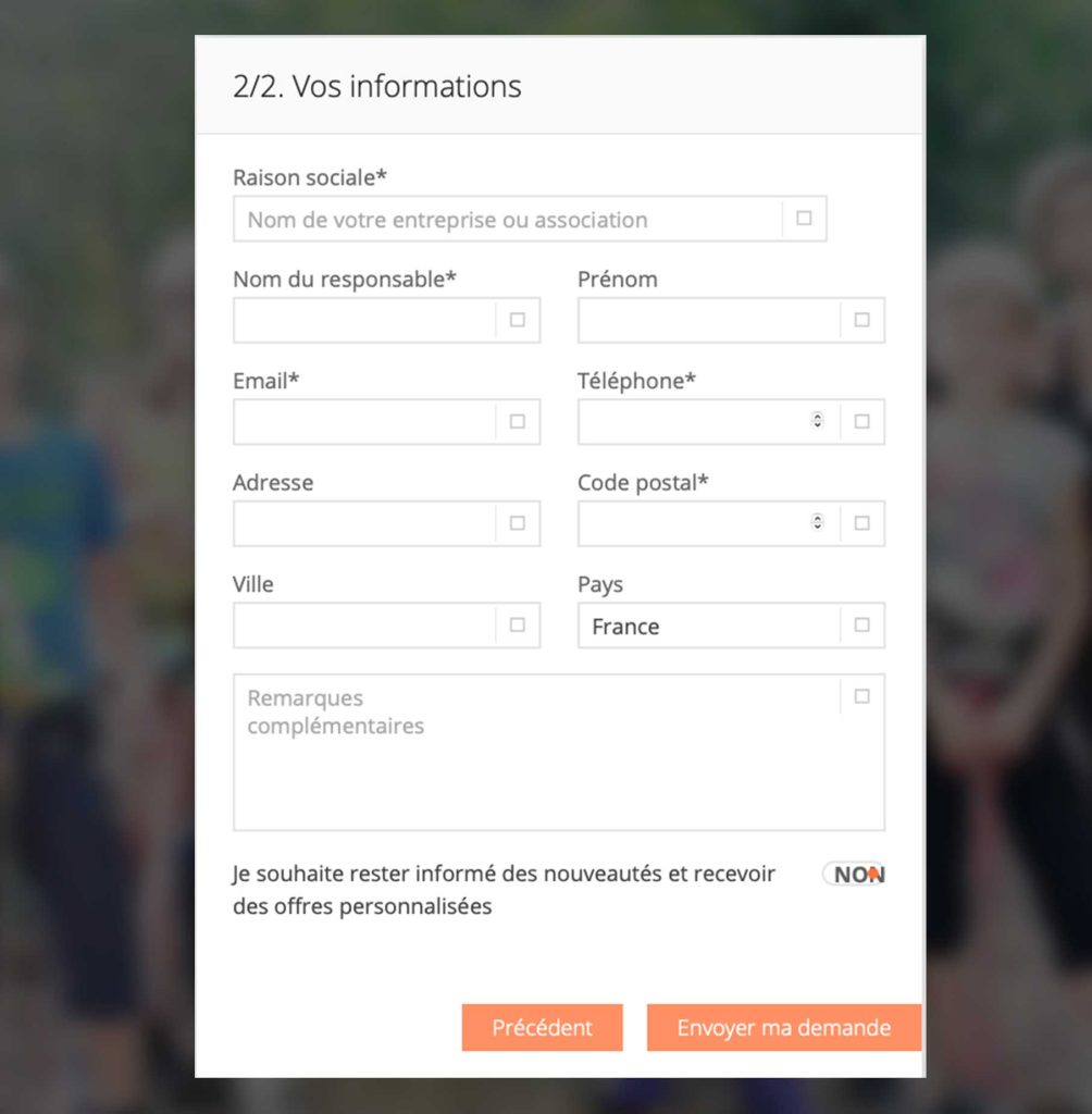
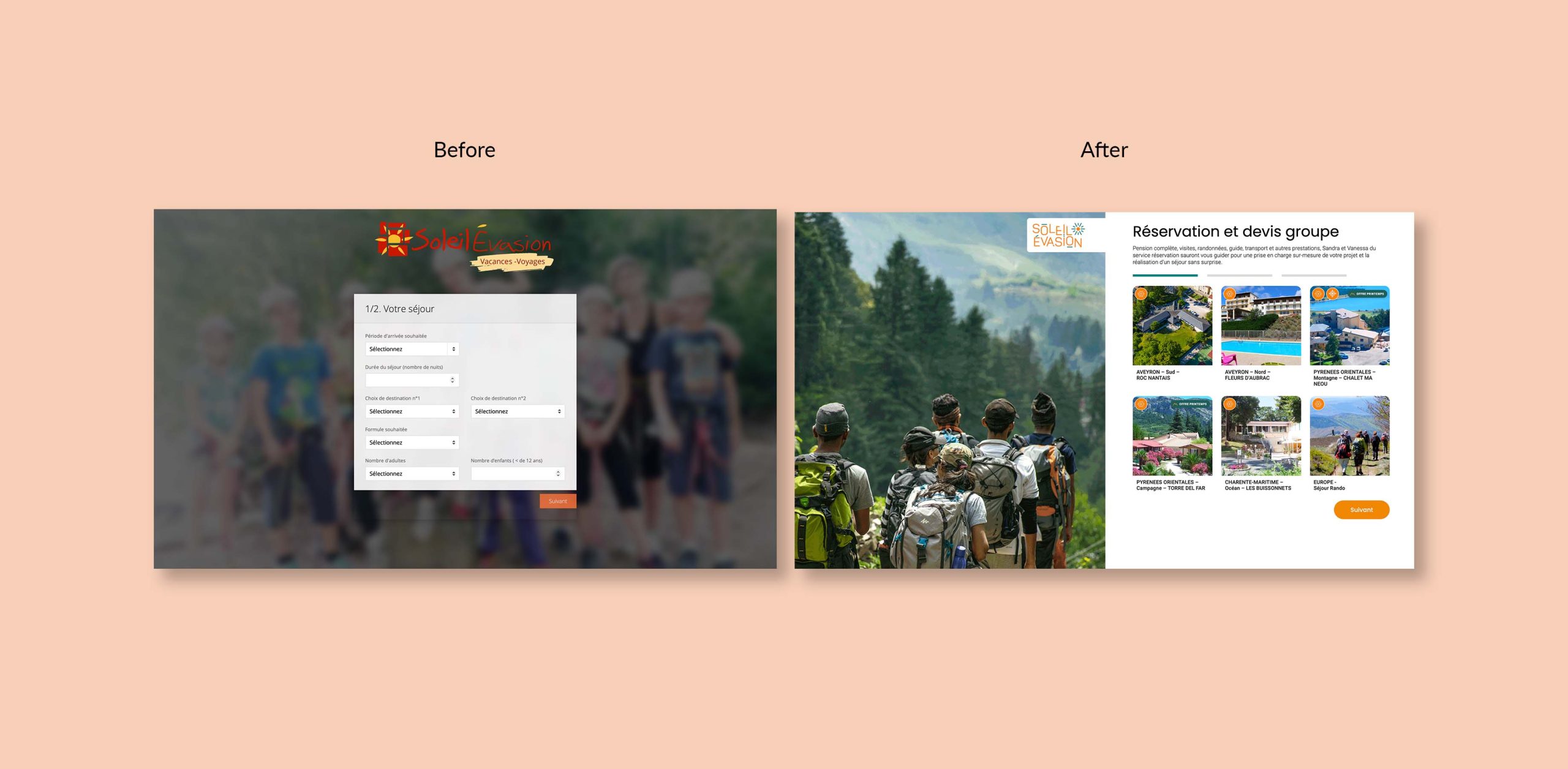
The legacy form audit highlights 5 key friction points:

1.  Unclear purpose : Booking or quote?

2. Inconsistent, hard-to use-inputs. Dropdowns and tiny spinners mixed together.

3. Ambiguous questions. Vague fields with no helper text.

4. Weak visual hierarchy and typography. Small, light labels with an uneven grid.

5. Distracting visuals + disconnected fields. Busy background, a detached logo, and a low-contrast button. Crucially, the corporate Raison sociale field was a mandatory requirement at the top, creating immediate drop-off risks for leisure vacationers.

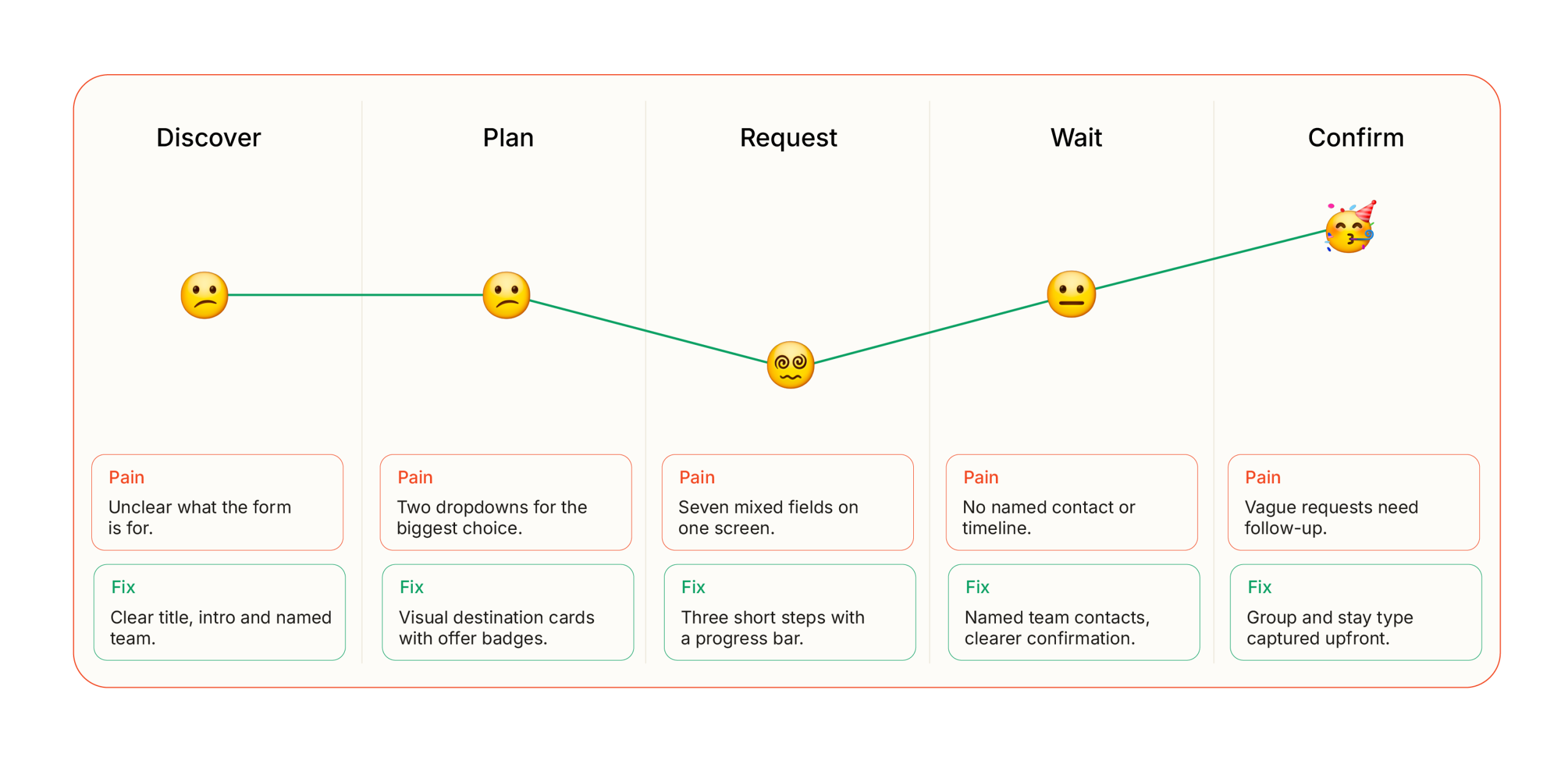
To systematically solve these friction points, I analyzed the user’s emotional highs and lows across the 5 core journey phases to transform anxiety into an intuitive checkout flow.

User Journey

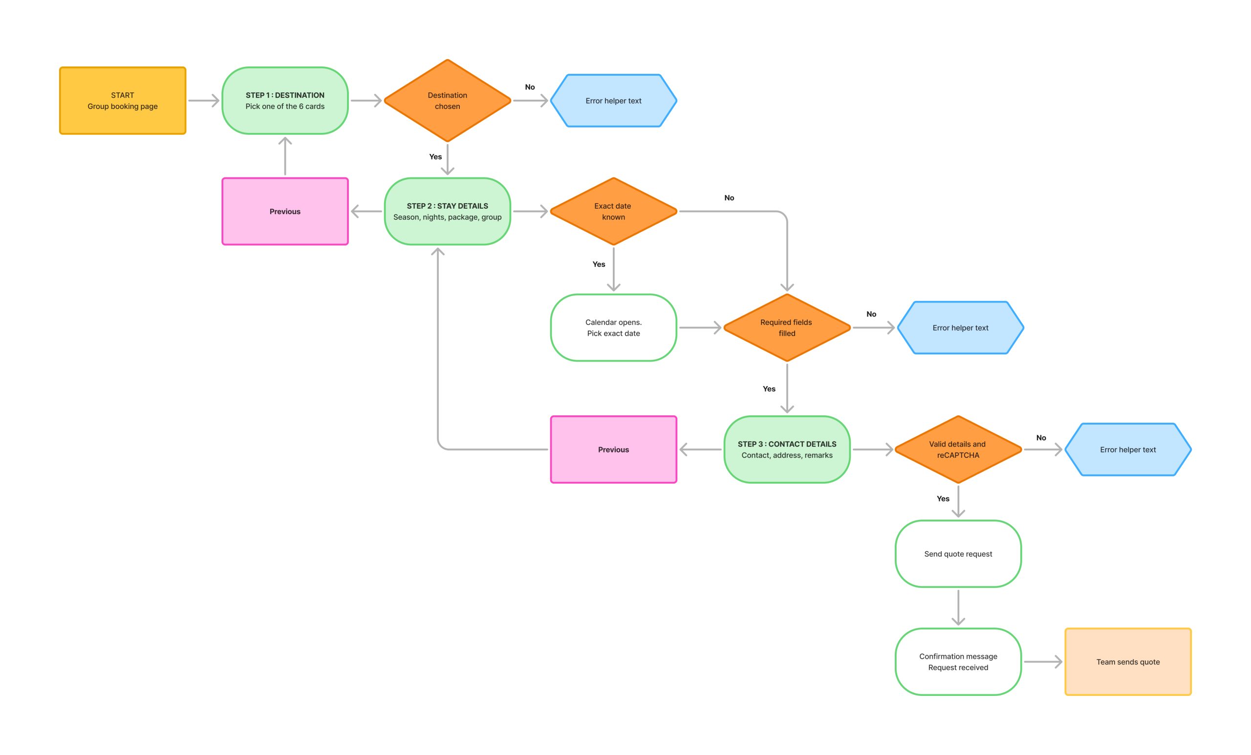
Following the emotion map, I re-architected the layout from a singular scrolling sheet into a Progressive Disclosure Wizard. This new flow separates target planning details from personal logistics, dynamically pruning unneeded fields based on step-one choices.
User Flow

Interface

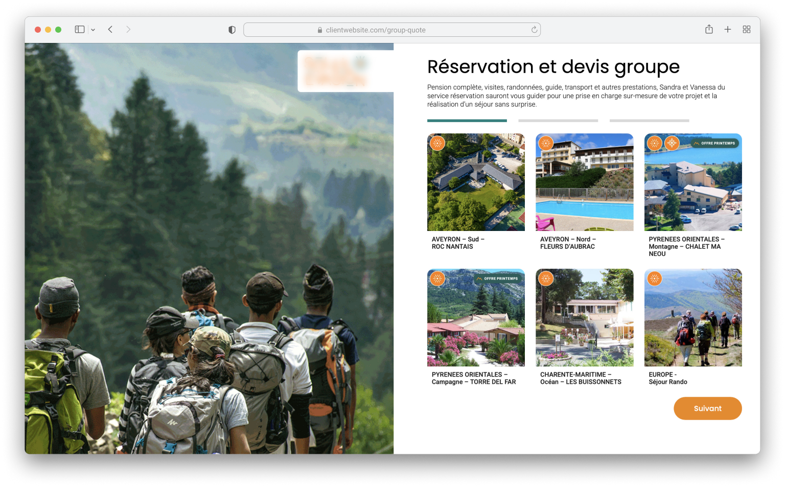
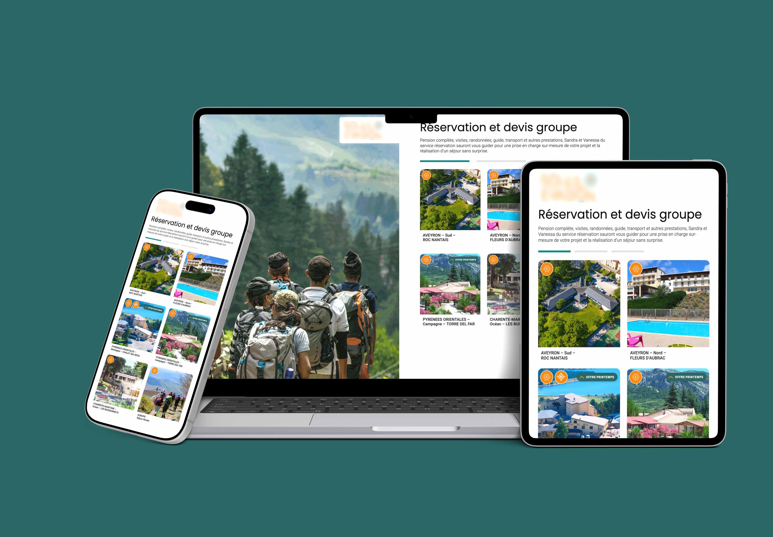
Screen: Stage 1

Destination Selection (Fixing Pain 1 & 2)
Uses interactive visual destination cards and prominent promotion badges (Offre Printemps). A clear “Suivant” progress stepper instantly shows users what comes next.

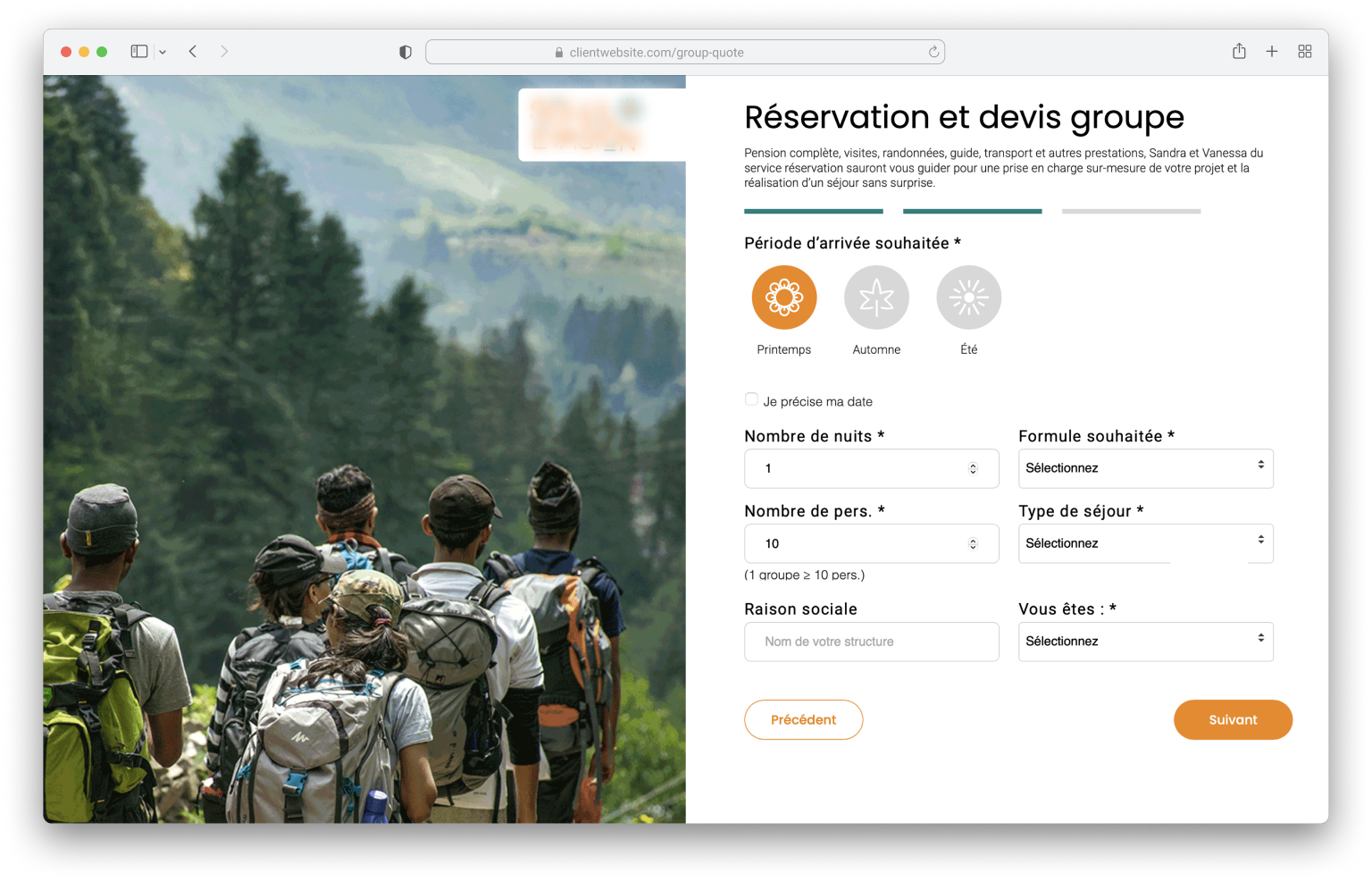
Screen: Stage 2

Travel Details & Logistics (Fixing Pain 3 & 4)
Groups related information into digestible buckets. Replaces uneven grids with a high-contrast typographic hierarchy and adds explicit inline helper copy to eliminate ambiguity.

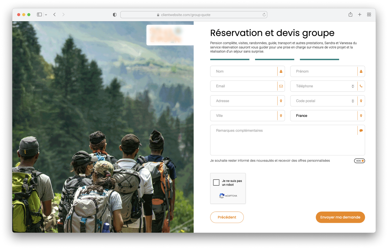
Screen: Stage 3

Personal Info & Business Compliance (Fixing Pain 5) Collects final user data. Crucially, the corporate Raison sociale field is placed at the very bottom as an optional field—preserving backend business requirements without blocking leisure vacationers.

The Visual Transformation

De-cluttering the Canvas: Stripped out heavy, distracting background photography in favor of high-contrast white space. This instantly isolates the interface, focusing the user’s attention purely on completing the form tasks.

Typographic Hierarchy & Grids: Replaced small, faint labels with a bold, structured typography scale. Every element sits on a strict horizontal layout grid, making the content effortlessly scannable for users on both mobile and desktop screens.

Component-Driven Consistency: Built standard interactive UI blocks—like uniform calendar selectors, badge chips, and prominent brand-aligned primary buttons—replacing the legacy look with an intuitive digital product feel.

What I would change :

cold B2B fields (demanding data like Raison sociale) that added aggressive friction for standard vacationers.