Brand Essence / Design Phycology & Solution
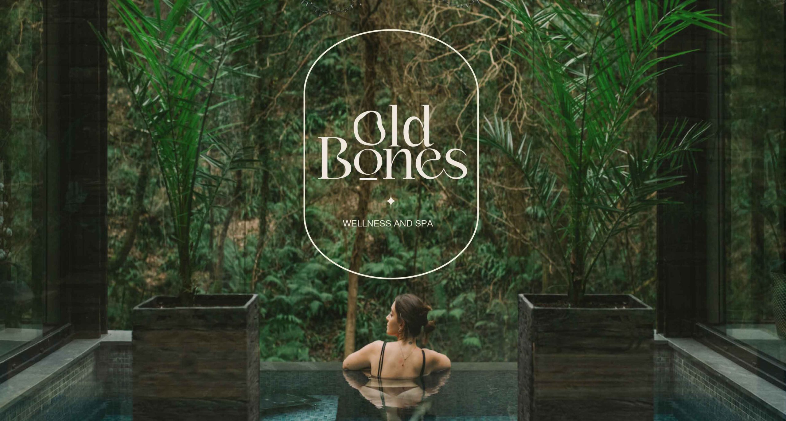
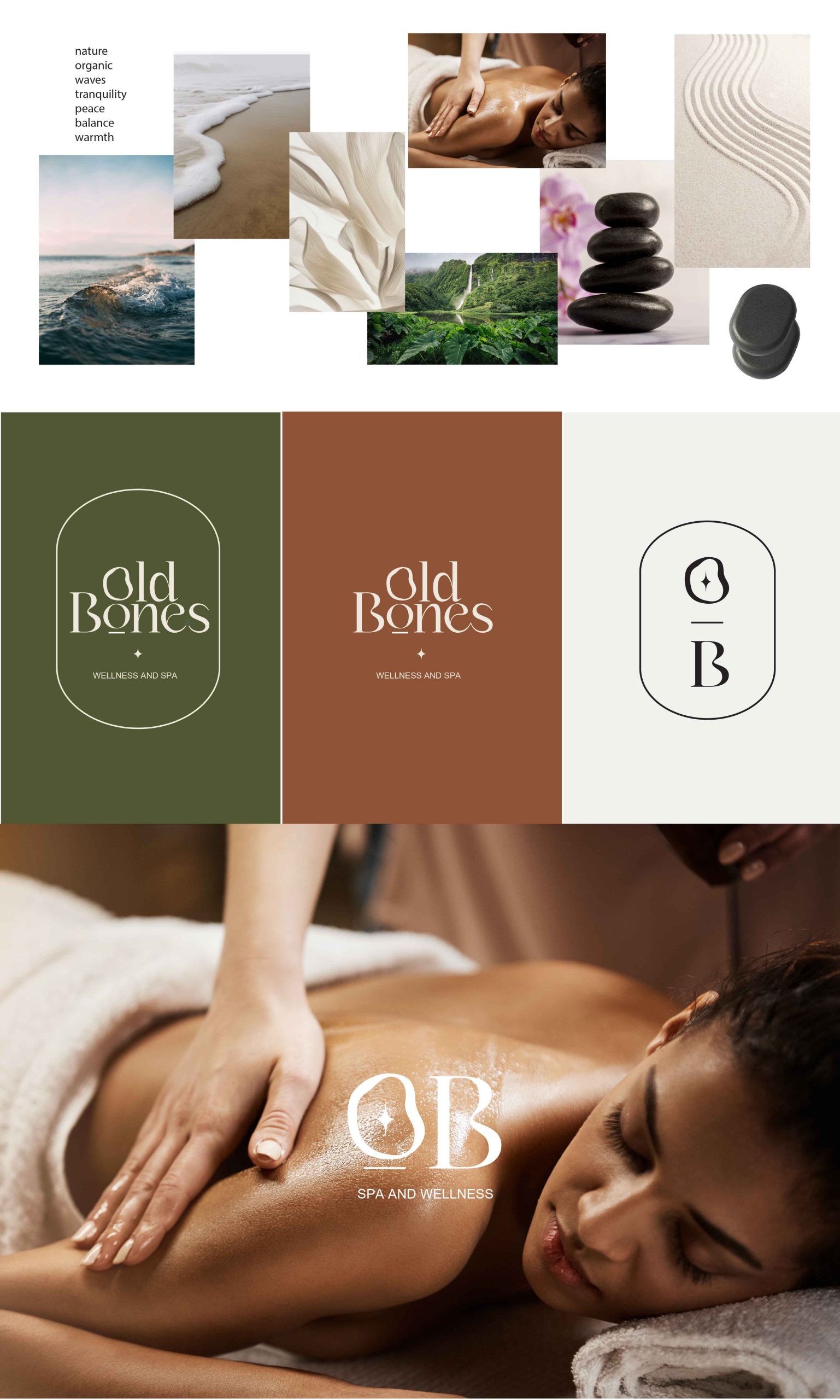
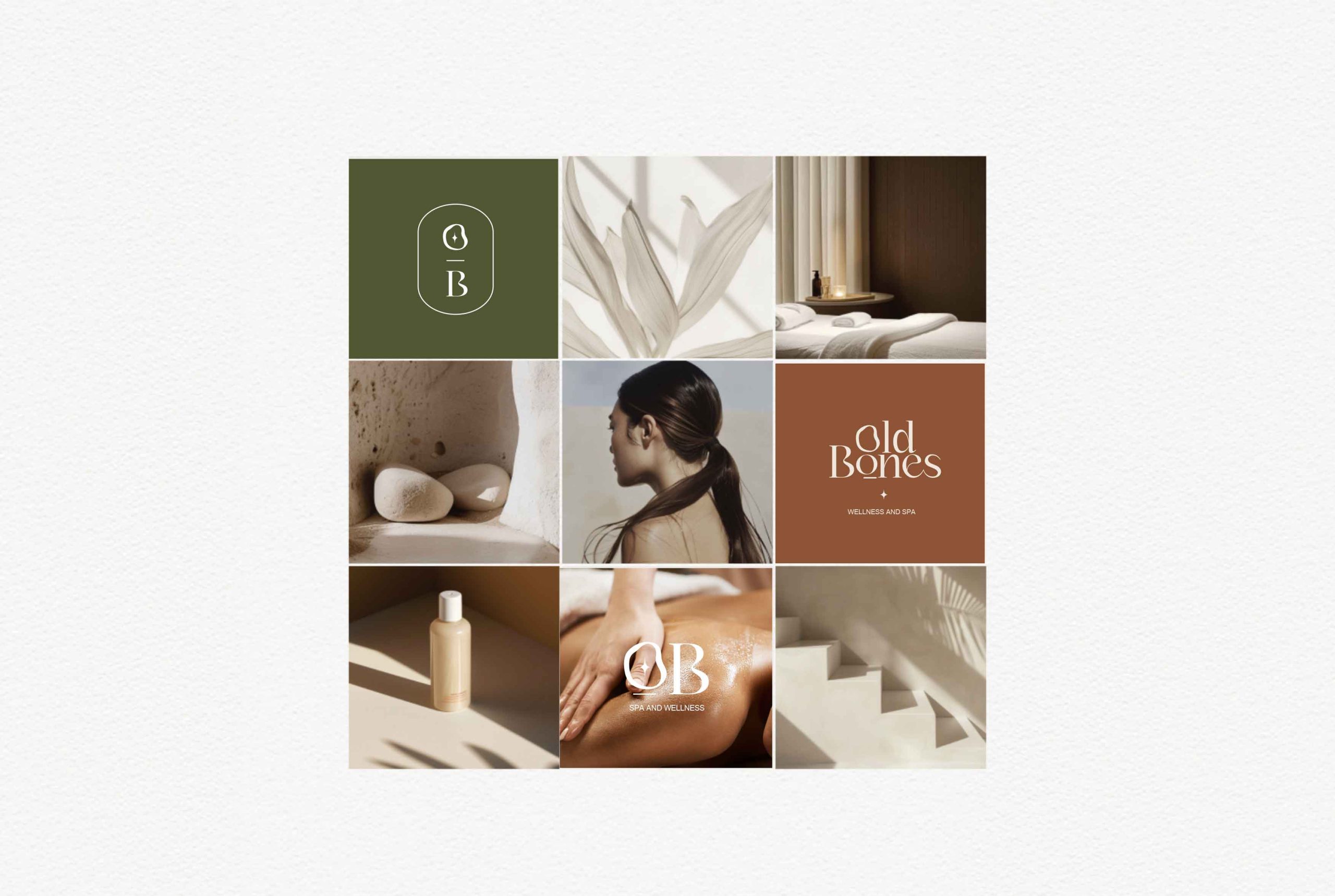
Old Bones is associated with relaxation, tranquillity, and an escape from the daily hustle. Elegant typography, with its smooth curves and refined lines, naturally conveys a sense of calm and sophistication. This helps to set the tone for the experience clients can expect.
The typography kerning & weight for flowing typography is generally easy on the eyes, enhancing readability without compromising on style. This ensures that marketing materials are both beautiful and functional, effectively communicating the spa’s message.
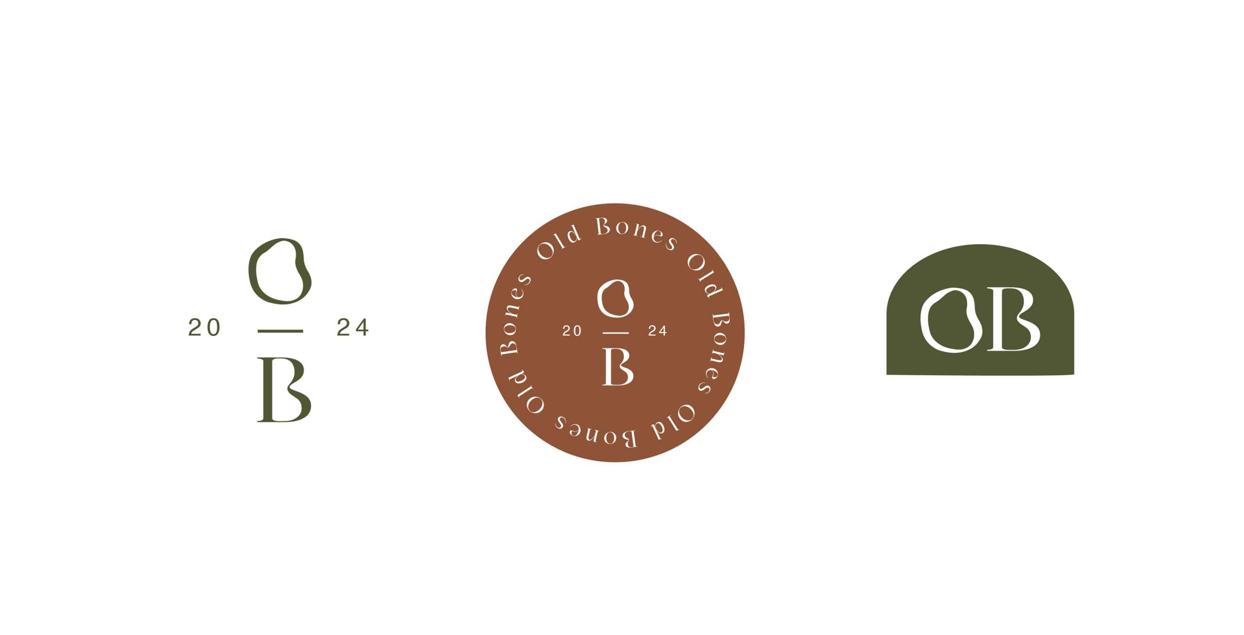
The logomark has been created with the letters ‘OB’ to keep the natural & relevant sense of nature with organic & elegant looks. It impacts balance to maintain & complement each other on the visualisation with logotype & logomark.